

A tap-to-pay mobile wallet for faster, simpler everyday payments in the Philippines
A tap-to-pay mobile wallet for faster, simpler everyday payments in the Philippines
A tap-to-pay mobile wallet for faster, simpler everyday payments in the Philippines
DASHPAY MOBILE APP
Making payments simple, so paying feels effortless.
Making payments simple, so paying feels effortless.
Making payments simple, so paying feels effortless.
DashPay is a concept mobile wallet that keeps your cards and Philippine digital bank accounts in one place, then lets you pay in-store with a single tap. It’s built for people who already pay digitally but still juggle QR codes, cash, and app-switching at checkout.
DashPay is a concept mobile wallet that keeps your cards and Philippine digital bank accounts in one place, then lets you pay in-store with a single tap. It’s built for people who already pay digitally but still juggle QR codes, cash, and app-switching at checkout.
DashPay is a concept mobile wallet that keeps your cards and Philippine digital bank accounts in one place, then lets you pay in-store with a single tap. It’s built for people who already pay digitally but still juggle QR codes, cash, and app-switching at checkout.

OVERVIEW
The Problem
The Problem
Digital payment adoption in the Philippines is high, but the in-store moment is still fragmented. People scan QR codes, dig for cash, or switch between apps depending on what the merchant takes. Interviews surfaced two blockers underneath the friction: checkout takes too many steps, and people don’t fully trust the method in front of them, especially when linking accounts. A wallet that only matches QR has no reason to win. It has to be faster and feel safer.
Digital payment adoption in the Philippines is high, but the in-store moment is still fragmented. People scan QR codes, dig for cash, or switch between apps depending on what the merchant takes. Interviews surfaced two blockers underneath the friction: checkout takes too many steps, and people don’t fully trust the method in front of them, especially when linking accounts. A wallet that only matches QR has no reason to win. It has to be faster and feel safer.
Digital payment adoption in the Philippines is high, but the in-store moment is still fragmented. People scan QR codes, dig for cash, or switch between apps depending on what the merchant takes. Interviews surfaced two blockers underneath the friction: checkout takes too many steps, and people don’t fully trust the method in front of them, especially when linking accounts. A wallet that only matches QR has no reason to win. It has to be faster and feel safer.
The Approach
The Approach
Chose tap over QR as the primary action. The trade-off: tap is less familiar, so the wallet and pay screens had to make the action obvious.
Chose tap over QR as the primary action. The trade-off: tap is less familiar, so the wallet and pay screens had to make the action obvious.
Made biometric auth visible on every tap. It adds a half-second, but it answers the top user fear directly, so I treated it as a trust feature, not a delay.
Made biometric auth visible on every tap. It adds a half-second, but it answers the top user fear directly, so I treated it as a trust feature, not a delay.
Used a recognizable card metaphor so an unfamiliar technology feels like something people already understand.
Used a recognizable card metaphor so an unfamiliar technology feels like something people already understand.
My Role
My Role
This was a self-directed concept project that I owned end to end—from user interviews and research synthesis to user flows, wireframes, high-fidelity designs, and the visual system.
To keep the work realistic, I designed around common fintech constraints such as biometric authentication, card-linking security requirements, and real-world contactless payment terminal behavior.
This was a self-directed concept project that I owned end to end—from user interviews and research synthesis to user flows, wireframes, high-fidelity designs, and the visual system.
To keep the work realistic, I designed around common fintech constraints such as biometric authentication, card-linking security requirements, and real-world contactless payment terminal behavior.
RESEARCH
User Interviews
User Interviews
I started with interviews to understand how people actually pay in-store and where it breaks down. The research revealed three recurring pain points: too many steps, app-switching fatigue, and low trust in the moment of payment.
I started with interviews to understand how people actually pay in-store and where it breaks down. The research revealed three recurring pain points: too many steps, app-switching fatigue, and low trust in the moment of payment.
“Most of the time, sending money to incorrect party, unable to cash-in, and no early warning for app update/offline.”

T. Marino
“What frustrates me is the system downtimes, transaction failures, and added fees with online payments . I also don’t feel fully secure linking e-wallets or using mobile banking for every purchase.”

J. Cruz
“I might get scammed because they’re getting the details. They don’t accept cards because their terminal is broken.”

M. Novio
“It suddenly crashes, or it doesn’t accept the payment method I want.”

C. Gracia
“Transaction speed and security worries me.”

R. Torno
Key Insights
Key Insights
People want fewer steps at checkout. QR feels familiar but isn’t always fast.
People want fewer steps at checkout. QR feels familiar but isn’t always fast.
Users routinely switch between multiple apps and cards depending on the merchant.
Users routinely switch between multiple apps and cards depending on the merchant.
Trust and security are major concerns when linking financial accounts
Trust and security are major concerns when linking financial accounts
There’s interest in contactless, but uncertainty about how it works.
There’s interest in contactless, but uncertainty about how it works.
Key Decisions
Key Decisions
Tap over QR as the primary action. The trade-off is that tap-to-pay is less familiar than scanning, so the wallet and pay screens had to make the action obvious and the security visible.
Tap over QR as the primary action. The trade-off is that tap-to-pay is less familiar than scanning, so the wallet and pay screens had to make the action obvious and the security visible.
Biometric / Face ID on every tap. This adds a step to the raw payment action, but it directly answers the number-one user fear. I treated that half-second as a trust feature, not a delay to optimize away.
Biometric / Face ID on every tap. This adds a step to the raw payment action, but it directly answers the number-one user fear. I treated that half-second as a trust feature, not a delay to optimize away.
One wallet for cards and digital banks. Consolidation is the core value, so card-add and bank-linking were designed as first-class flows rather than buried in settings.
One wallet for cards and digital banks. Consolidation is the core value, so card-add and bank-linking were designed as first-class flows rather than buried in settings.
SOLUTION
The Proposed Solution
The Proposed Solution
One place for your cards. One easy way to pay.
One place for your cards. One easy way to pay.

USERFLOWS
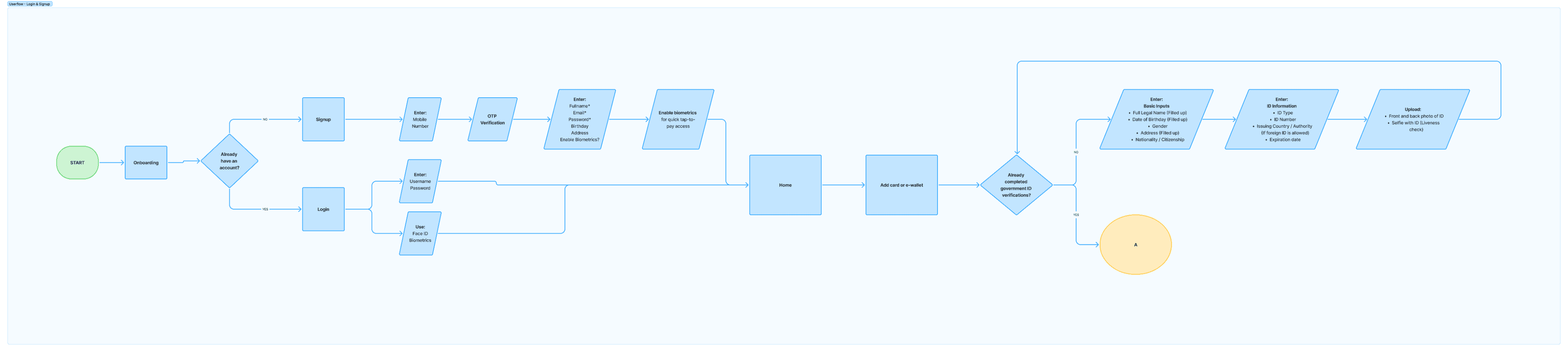


WIREFRAMES
Wireframing
Wireframing
I created wireframes to explore the layout and flow of DashPay’s core features. This helped establish a clear and intuitive foundation for the user experience before designing the final interface.
I created wireframes to explore the layout and flow of DashPay’s core features. This helped establish a clear and intuitive foundation for the user experience before designing the final interface.

HI-FIDELITY DESIGNS
Final UI
Final UI
The final interface was design to feel simple, fast, secure, and familiar to Filipino fintech users.
The final interface was design to feel simple, fast, secure, and familiar to Filipino fintech users.
The final interface was design to feel simple, fast, secure, and familiar to Filipino fintech users.
Splash Screen and Onboarding
Splash Screen and Onboarding


Login
Login
Sign up
Sign up


Home / Wallet
Home / Wallet
Home / Wallet
Home / Wallet
Add payment method slideout
Add payment method slideout


Adding a card
Adding a card
Enter card details manually or scan the card
Enter card details manually or scan the card
Linking a digital bank
Linking a digital bank
Securely connect your account from supported digital banks in the Philippines.
Securely connect your account from supported digital banks in the Philippines.


Tapping a card to pay
Tapping a card to pay
Every tap is secured with Face ID or biometric authentication.
Every tap is secured with Face ID or biometric authentication.
Paying with a tap
Paying with a tap
Securely connect your account from supported digital banks in the Philippines.
Securely connect your account from supported digital banks in the Philippines.


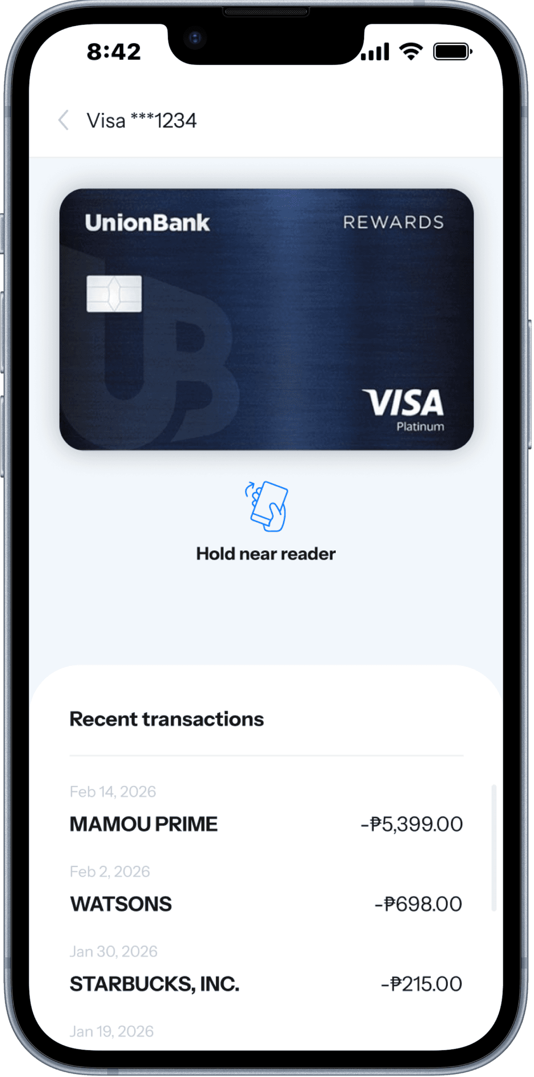
Transaction history
Transaction history
My Account
My Account

Splash Screen and Onboarding
Login

Sign up
Home / Wallet
Home / Wallet
Add payment method slideout
Adding a card
Enter card details manually or scan the card
Linking a digital bank
Securely connect your account from supported digital banks in the Philippines.
Tapping a card to pay
Every tap is secured with Face ID or biometric authentication.
Paying with a tap
Securely connect your account from supported digital banks in the Philippines.
Transaction history
My Account
STYLE GUIDES
Visual Direction
Visual Direction
The DashPay visual system was designed to feel modern, trustworthy, and easy to use.
The DashPay visual system was designed to feel modern, trustworthy, and easy to use.
Color Palette
Color Palette
Brand Colors
BLUE
500
#0077FF
400
#4993FF
400
#4993FF
300
#7AADFF
300
#7AADFF
200
#A6C9FF
200
#A6C9FF
100
#D3E3FF
100
#D3E3FF
50
#E8F1FF
50
#E8F1FF
YELLOW
500
#FFB222
400
#FFC15A
400
#FFC15A
300
#FFD187
300
#FFD187
200
#FFE1B0
200
#FFE1B0
100
#FFEFD7
100
#FFEFD7
50
#FFF8EA
50
#FFF8EA
Neutral Colors
BLACK 500
#171717
Dark Gray 500
#555555
#555555
Gray 500
#CACACA
#CACACA
Light Gray 500
#EEEEEE
#EEEEEE
White 500
#FFFFFF
#FFFFFF
Typography
Typography
Instrument Sans
Instrument Sans
Instrument Sans
BOLD
BOLD
SEMI-BOLD
SEMI-BOLD
MEDIUM
MEDIUM
REGULAR
REGULAR
Heading 1
Size
Weight
Letter Space
Line Height
Casing
32
Bold
0%
40
Sentence case
Heading 2
Size
Weight
Letter Space
Line Height
Casing
24
Bold
0%
30
Sentence case
Heading 3
Size
Weight
Letter Space
Line Height
Casing
20
Bold
0%
24
Sentence case
Heading 4
Size
Weight
Letter Space
Line Height
Casing
16
Bold
0%
20
Sentence case
Heading 5
Size
Weight
Letter Space
Line Height
Casing
14
Bold
0%
16
Sentence case
Heading 6
Size
Weight
Letter Space
Line Height
Casing
12
Bold
0%
14
Sentence case
Paragraph Large
Size
Weight
Letter Space
Line Height
Casing
16
Regular
0%
18
Sentence case
Paragraph Medium
Size
Weight
Letter Space
Line Height
Casing
14
Regular
0%
16
Sentence case
Paragraph Small
Size
Weight
Letter Space
Line Height
Casing
12
Regular
0%
14
Sentence case
Paragraph Extra Small
Size
Weight
Letter Space
Line Height
Casing
10
Regular
0%
12
Sentence case
Button Large
Size
Weight
Letter Space
Line Height
Casing
24
Bold
8%
18
Uppercase
Button Medium
Size
Weight
Letter Space
Line Height
Casing
16
Bold
8%
18
Uppercase
Button Small
Size
Weight
Letter Space
Line Height
Casing
12
Bold
8%
14
Uppercase
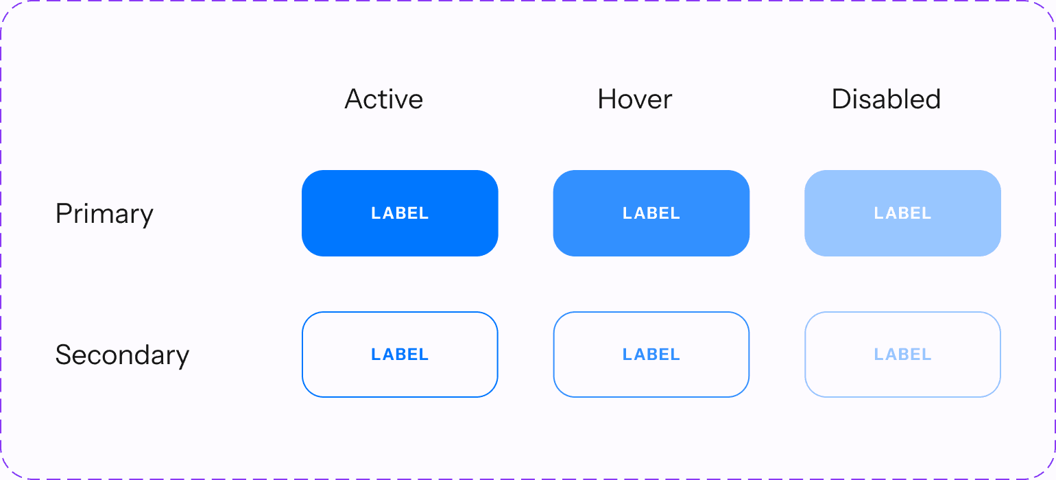
Button Styles
Button Styles
Active
Hover
Disabled
Primary
Label
Label
Label
Label
Secondary
Label
Label
Label
Label
Form Fields
Form Fields
Text Input
Select
Blank
Field name
Value
Field name
Value
Focused
Field name
Value
Interactive
Field name
Value
Ideal
Field name
Value
Field name
Value
Error
Field name
Value
Field name
Value

Iconography
Iconography

TAKEAWAYS
Outcome / Impact
Outcome / Impact
As a concept project, DashPay wasn’t shipped, so the outcomes below reflect the intended impact rather than measured results.
As a concept project, DashPay wasn’t shipped, so the outcomes below reflect the intended impact rather than measured results.
Projected user impact
Projected user impact
One-tap, authenticated in-store checkout instead of a multi-step QR flow.
One-tap, authenticated in-store checkout instead of a multi-step QR flow.
Greater trust through visible biometric confirmation on every payment.
Greater trust through visible biometric confirmation on every payment.
Projected business impact
Projected business impact
A faster, more trustworthy payment experience that differentiates DashPay from QR-only wallets.
A faster, more trustworthy payment experience that differentiates DashPay from QR-only wallets.
Increased user retention by letting people manage cards and digital banks in one app.
Increased user retention by letting people manage cards and digital banks in one app.
Learnings
Learnings
Letting Research Lead
Letting Research Lead
This project reinforced the value of letting user research guide design decisions. Security concerns consistently surfaced during interviews, leading me to make biometric authentication a visible part of the payment experience rather than a hidden step. Looking back, I would strengthen the research by interviewing a larger and more diverse group of participants, then validate the concept through usability testing and timed comparisons against QR payments. I’d also design and test failure states, such as declined payments and offline scenarios, to ensure the experience remains reliable beyond the happy path.
This project reinforced the value of letting user research guide design decisions. Security concerns consistently surfaced during interviews, leading me to make biometric authentication a visible part of the payment experience rather than a hidden step. Looking back, I would strengthen the research by interviewing a larger and more diverse group of participants, then validate the concept through usability testing and timed comparisons against QR payments. I’d also design and test failure states, such as declined payments and offline scenarios, to ensure the experience remains reliable beyond the happy path.
This project reinforced the value of letting user research guide design decisions. Security concerns consistently surfaced during interviews, leading me to make biometric authentication a visible part of the payment experience rather than a hidden step. Looking back, I would strengthen the research by interviewing a larger and more diverse group of participants, then validate the concept through usability testing and timed comparisons against QR payments. I’d also design and test failure states, such as declined payments and offline scenarios, to ensure the experience remains reliable beyond the happy path.
Back to works
Let’s Connect
Got a
challenge?
COnnect with me
or contact me directly at
alipiotrisha@gmail.com


Let’s Connect
Got a
challenge?
COnnect with me
or contact me directly at
alipiotrisha@gmail.com
Let’s Connect
Got a
challenge?
COnnect with me
or contact me directly at
alipiotrisha@gmail.com