
Buyong
Buyong
A local grocery mobile app for public market
A local grocery mobile app for public market
A local grocery mobile app for public market
BUYONG MOBILE APP
Bringing the palengke online, without losing what makes it work.
Bringing the palengke online, without losing what makes it work.
Bringing the palengke online, without losing what makes it work.
Buyong is a mobile grocery app built around the Filipino public market, the palengke. It lets people browse stalls, buy fresh produce, track orders, and watch vendors sell live.
The name plays on “bayong,” the woven market bag Filipinos carry to the palengke, and the product is the digital version of it.
Buyong is a mobile grocery app built around the Filipino public market, the palengke. It lets people browse stalls, buy fresh produce, track orders, and watch vendors sell live.
The name plays on “bayong,” the woven market bag Filipinos carry to the palengke, and the product is the digital version of it.
Buyong is a mobile grocery app built around the Filipino public market, the palengke. It lets people browse stalls, buy fresh produce, track orders, and watch vendors sell live.
The name plays on “bayong,” the woven market bag Filipinos carry to the palengke, and the product is the digital version of it.

OVERVIEW
The Problem
The Problem
Most grocery apps in the Philippines follow a supermarket model: fixed catalogs, standard pricing, and anonymous transactions. The palengke operates differently, with vendor relationships, daily-changing inventory, and trust built over time. This gap leaves shoppers relying on in-person visits and sellers without a digital storefront that matches how they actually sell.
The goal wasn’t to replace the palengke with a supermarket app, but to bring its core experience—relationships, flexibility, and trust—into a digital format.
Most grocery apps in the Philippines follow a supermarket model: fixed catalogs, standard pricing, and anonymous transactions. The palengke operates differently, with vendor relationships, daily-changing inventory, and trust built over time. This gap leaves shoppers relying on in-person visits and sellers without a digital storefront that matches how they actually sell.
The goal wasn’t to replace the palengke with a supermarket app, but to bring its core experience—relationships, flexibility, and trust—into a digital format.
Most grocery apps in the Philippines follow a supermarket model: fixed catalogs, standard pricing, and anonymous transactions. The palengke operates differently, with vendor relationships, daily-changing inventory, and trust built over time. This gap leaves shoppers relying on in-person visits and sellers without a digital storefront that matches how they actually sell.
The goal wasn’t to replace the palengke with a supermarket app, but to bring its core experience—relationships, flexibility, and trust—into a digital format.
The Approach
Anchored on vendors, not just a catalog. The app leads with stores, products, and reviews so buyers choose sellers, the way the palengke actually works.
Anchored on vendors, not just a catalog. The app leads with stores, products, and reviews so buyers choose sellers, the way the palengke actually works.
Anchored on vendors, not just a catalog. The app leads with stores, products, and reviews so buyers choose sellers, the way the palengke actually works.
Kept live selling central, not a gimmick. It’s the closest digital match to how vendors build trust in person.
Kept live selling central, not a gimmick. It’s the closest digital match to how vendors build trust in person.
Kept live selling central, not a gimmick. It’s the closest digital match to how vendors build trust in person.
Login, checkout, and order tracking follow familiar conventions, allowing the more innovative parts of the experience to stand out without increasing the learning curve.
Login, checkout, and order tracking follow familiar conventions, allowing the more innovative parts of the experience to stand out without increasing the learning curve.
Login, checkout, and order tracking follow familiar conventions, allowing the more innovative parts of the experience to stand out without increasing the learning curve.
My Role
One of two designers on a team design challenge. We shared research, flows, wireframes, and UI, and built on each other’s work rather than splitting the app in half.
One of two designers on a team design challenge. We shared research, flows, wireframes, and UI, and built on each other’s work rather than splitting the app in half.
One of two designers on a team design challenge. We shared research, flows, wireframes, and UI, and built on each other’s work rather than splitting the app in half.
SOLUTION
The Proposed Solution
The Proposed Solution
One place for your cards. One easy way to pay.
One place for your cards. One easy way to pay.

USERFLOWS

WIREFRAMES
Wireframing
Wireframing
We created wireframes to explore the layout and flow of Buyong’s core features, from browsing stalls to checkout and live selling. This set a clear, intuitive foundation for the experience before moving into the final interface.
We created wireframes to explore the layout and flow of Buyong’s core features, from browsing stalls to checkout and live selling. This set a clear, intuitive foundation for the experience before moving into the final interface.
I created wireframes to explore the layout and flow of DashPay’s core features. This helped establish a clear and intuitive foundation for the user experience before designing the final interface.

HI-FIDELITY DESIGNS
Final UI
Final UI
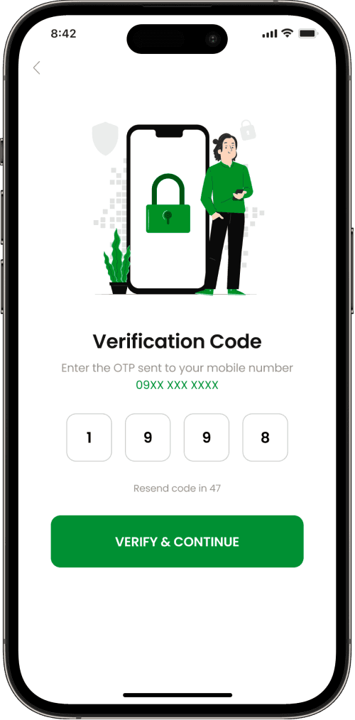
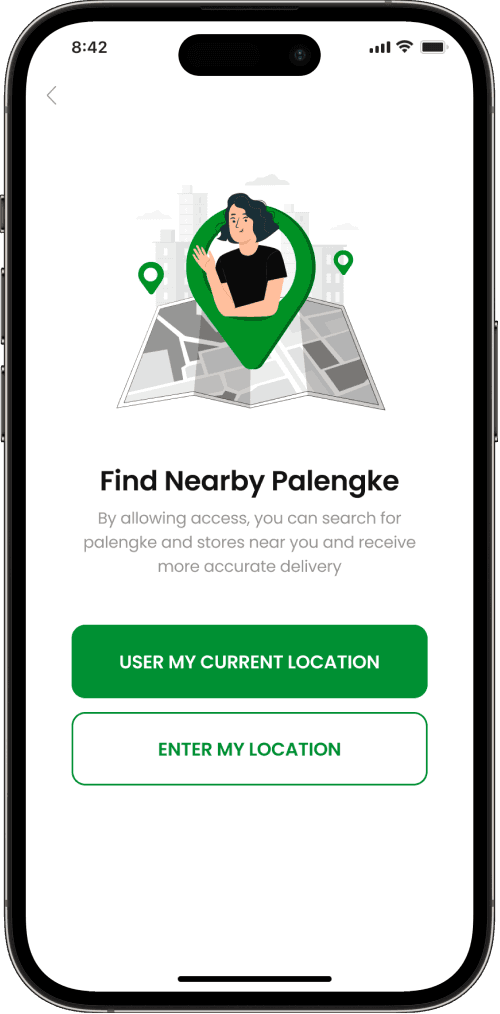
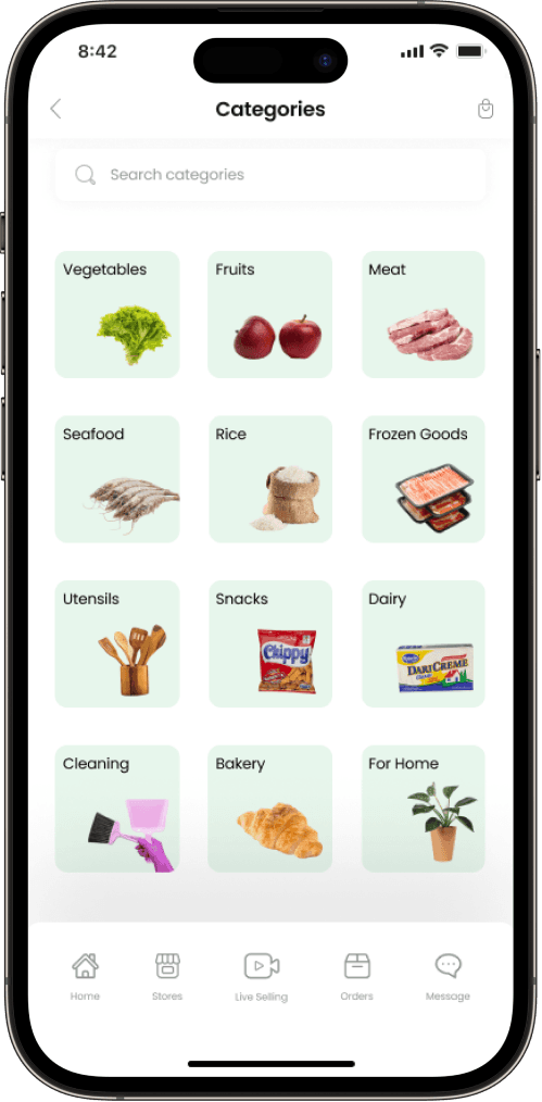
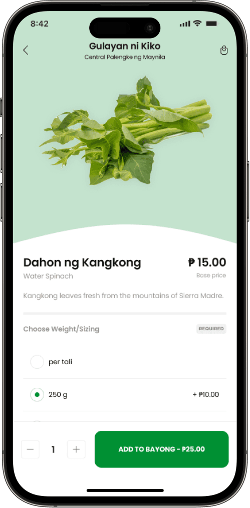
The final interface was designed to feel fresh, trustworthy, and familiar to Filipino market shoppers. A green palette and clean Poppins type keep the produce front and center, while the store, review, and live-selling screens carry the vendor-led feel of the palengke into the product.
The final interface was designed to feel fresh, trustworthy, and familiar to Filipino market shoppers. A green palette and clean Poppins type keep the produce front and center, while the store, review, and live-selling screens carry the vendor-led feel of the palengke into the product.
The final interface was designed to feel fresh, trustworthy, and familiar to Filipino market shoppers. A green palette and clean Poppins type keep the produce front and center, while the store, review, and live-selling screens carry the vendor-led feel of the palengke into the product.
Splash Screen
Splash Screen

Login Process
Login Process



Home & Categories
Home & Categories

Stores, products, & reviews
Stores, products, & reviews


Checkout process and tracking of order
Checkout process and tracking of order


Live Selling & CHat
Live Selling & CHat


STYLE GUIDES
Color Palette
Brand Colors
Irish Green
500
#009033
400
#4DA75E
400
#4DA75E
300
#7EBC87
300
#7EBC87
200
#A9D3AF
200
#A9D3AF
100
#D5E8D8
100
#D5E8D8
50
#E9F3EA
50
#E9F3EA
Green Haze
500
#00B440
400
#56C369
400
#56C369
300
#84D390
300
#84D390
200
#AEE1B5
200
#AEE1B5
100
#D7F1DA
100
#D7F1DA
50
#EAF7EC
50
#EAF7EC
Edge Water
500
#C4E3CE
400
#D0E8D8
400
#D0E8D8
300
#DBEEE2
300
#DBEEE2
200
#E7F4EB
200
#E7F4EB
100
#F3F9F6
100
#F3F9F6
50
#F9FCFA
50
#F9FCFA
Neutral Colors
Onyx 500
#121212
Mist 500
#959595
Concrete 500
#F2F2F2
Snow 500
#FFFFFF
Typography
Poppins
Poppins
BOLD
BOLD
SEMI-BOLD
SEMI-BOLD
MEDIUM
MEDIUM
REGULAR
REGULAR
a b c d e f g h i j k l m n o p q r s t u v w x y z
a b c d e f g h i j k l m n o p q r s t u v w x y z
a b c d e f g h i j k l m n o p q r s t u v w x y z
a b c d e f g h i j k l m n o p q r s t u v w x y z
1 2 3 4 5 6 7 8 9 0
1 2 3 4 5 6 7 8 9 0
TAKEAWAYS
Outcome / Impact
Overall
A team design challenge, so no production metrics:
A team design challenge, so no production metrics:
A complete product delivered in a challenge timeline: full flow, wireframes, hi-fi UI, and a visual system, from a two-person team.
A complete product delivered in a challenge timeline: full flow, wireframes, hi-fi UI, and a visual system, from a two-person team.
A complete product delivered in a challenge timeline: full flow, wireframes, hi-fi UI, and a visual system, from a two-person team.
A clear point of view, digitizing the palengke instead of cloning a supermarket app.
A clear point of view, digitizing the palengke instead of cloning a supermarket app.
A clear point of view, digitizing the palengke instead of cloning a supermarket app.
A vendor-first model that gives public-market sellers a storefront they don't have online.
A vendor-first model that gives public-market sellers a storefront they don't have online.
A vendor-first model that gives public-market sellers a storefront they don't have online.
Learnings
Designing Around Real Behavior
Designing Around Real Behavior
Designing around real palengke behavior instead of a typical supermarket app helped create a more authentic experience, with live selling becoming the feature that defines the product. Given the limited timeline, some flows like checkout and account management relied on familiar patterns without user validation. If we continued the project, I’d test the vendor-first browsing experience with users and design for real-world scenarios such as stockouts, changing prices, and product substitutions.
Designing around real palengke behavior instead of a typical supermarket app helped create a more authentic experience, with live selling becoming the feature that defines the product. Given the limited timeline, some flows like checkout and account management relied on familiar patterns without user validation. If we continued the project, I’d test the vendor-first browsing experience with users and design for real-world scenarios such as stockouts, changing prices, and product substitutions.
Back to works
Let’s Connect
Got a
challenge?
COnnect with me
or contact me directly at
alipiotrisha@gmail.com


Let’s Connect
Got a
challenge?
COnnect with me
or contact me directly at
alipiotrisha@gmail.com
Let’s Connect
Got a
challenge?
COnnect with me
or contact me directly at
alipiotrisha@gmail.com